prev

next

Finstreet

Unlocking direct access to private and public markets

I led the design of Finstreet’s landing and investment experience — creating an immersive four halls interface to introduce services (Invest, Raise, Custody, Advisory) and build immediate trust with investors.

Product

Landing Page

Skills

Product design
UX Strategy
Interactive Prototyping
Stakeholder Collaboration

My role

Product designer
UX Engineer

Timeline

Sep 2022 – Feb 2024

Collaborators

Managing Directors (Stakeholders), Project Managers, Front-end/Back-end Engineers, Compliance Officers.

Problem

New visitors arrived at Finstreet unsure of what the platform offered. They often left before exploring deeper

Reasons

Services weren’t clearly explained.

Early wording was generic so users couldn’t tell who the platform was for.

Trust and legitimacy weren’t established upfront.

In feedback, 3/5 testers said they looked for regulator logos first.

Navigation between offerings felt overwhelming.

Analytics showed 40% bounce at the hero — users didn’t know where to start.

I recognized this as an opportunity to reframe the landing experience so investors understood the value in seconds, built trust earlier, and felt confident to explore further.

Research

Design discussions revealed stakeholders wanted users to feel as if they were entering different halls through four distinct doors so I analyzed competitor sites and ran feedback sessions with early investors.

Common painpoints

Confusion about what Finstreet actually provided

4/6 testers couldn’t clearly explain the difference between services after their first visit.

Hesitation due to lack of visible regulatory anchors

70% of participants said they looked for ADGM/FAB/IHC logos before exploring further.

No clear separation of services

Users often clicked back and forth, unsure whether “Invest” or “Raise” fit their need.

High bounce rates from an overly generic landing

Analytics showed nearly 40% of visitors dropped off without scrolling.

Solution

I designed an immersive landing and investment flow so investors could explore Finstreet with clarity and trust.

When users interact with the landing:

Hero with four service tiles

Market stats ticker

Partner & regulator logos upfront

Clear service taxonomy

LIVE NOW deal cards

Consistent investment cards

My principle
Trust by design.

I focused on creating an experience where every touchpoint reinforced clarity and credibility from the first landing tile to the final investment dashboard. The goal was to build confidence early, not just design a beautiful interface.
I paid careful attention to every touchpoint so investors felt trust and direction at each step, going beyond a landing page to build confidence in the entire journey.

Explore services through four distinct doors

Invest, Raise, Custody, and Advisory each open into unique service halls with tailored content.

Build instant trust with regulatory anchors.

Logos of ADGM, FAB, and IHC are displayed upfront to reinforce legitimacy.

Market insights at a glance

A stats ticker ($2.3T dry powder, 14.7K deals closed, etc.) conveys scale and credibility immediately.

Build instant trust with regulatory anchors.

Logos of ADGM, FAB, and IHC are displayed upfront to reinforce legitimacy.

Impact
Trust & confidence for investors.

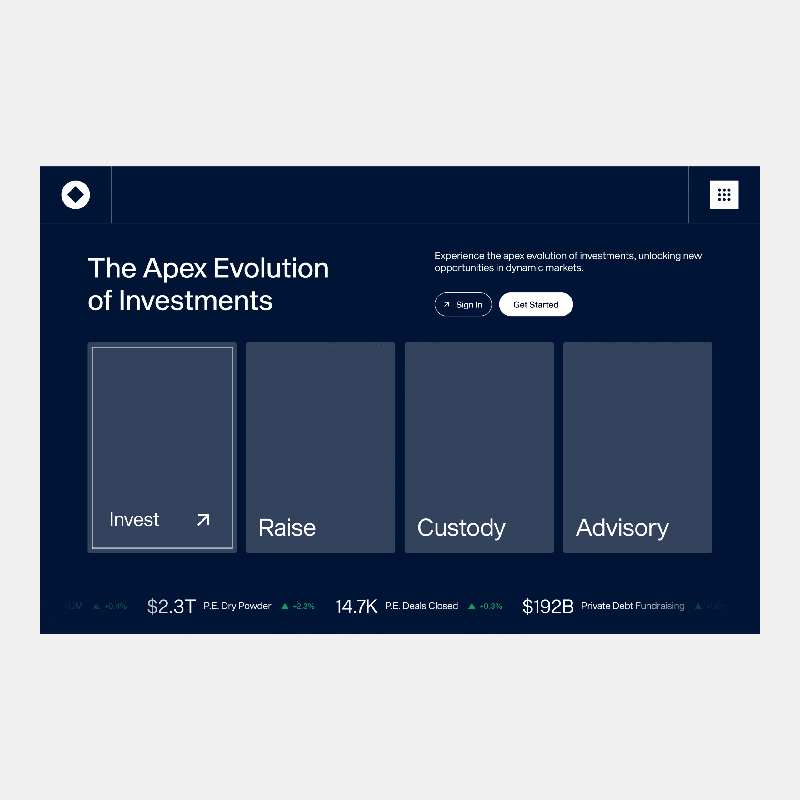
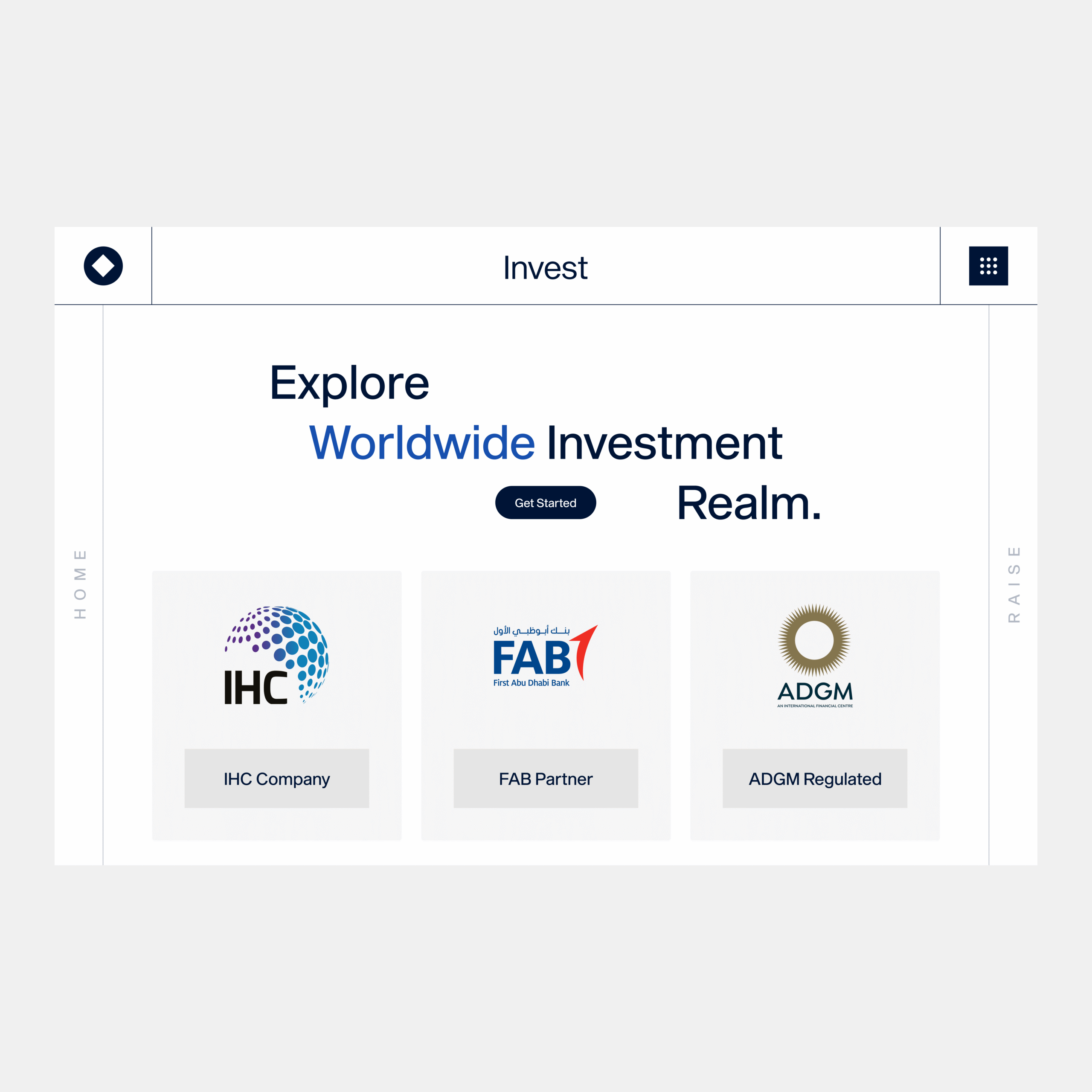
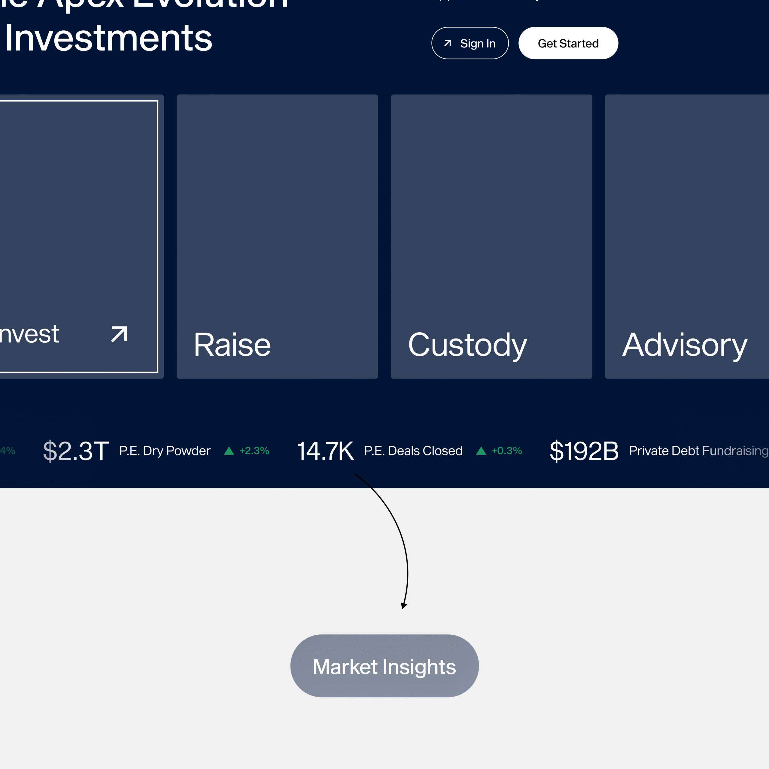
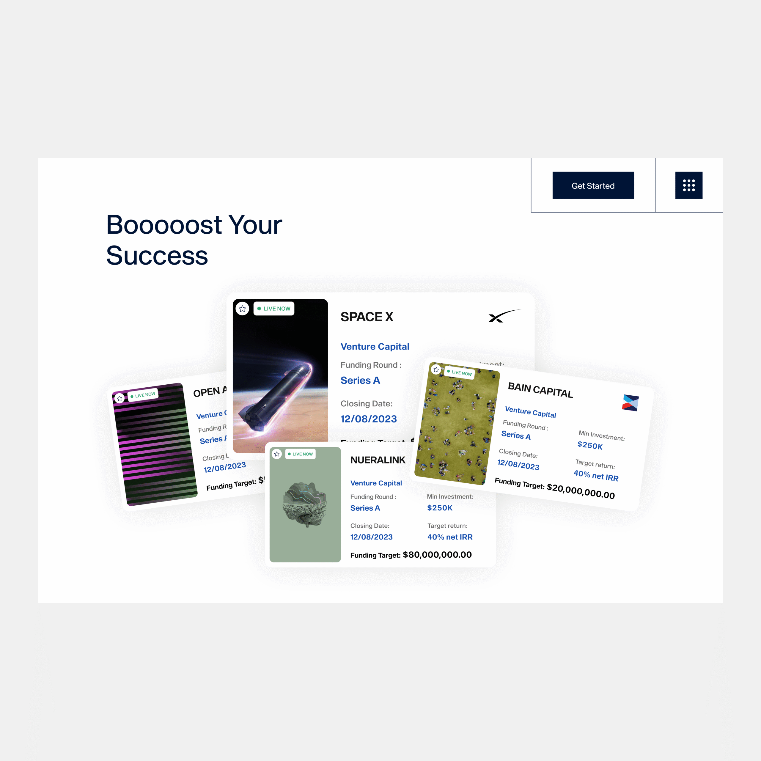
Not many things are as rewarding as seeing users interact with a product that instantly builds trust. By designing a landing that clearly separated services, surfaced credibility markers, and streamlined the investment flow, I helped Finstreet position itself as a transparent and professional gateway to private markets.
Before After

halelink